Histogram As A Component Of Seven Basic Quality Tools
In the Project Management Professional (PMP) exam, histograms are valuable quality planning and control tools. A histogram visualizes two variables that are particularly helpful when sharing information about issues, defects, or quality-related matters with stakeholders. For example, a histogram can present the reasons for defects on one axis and the corresponding number of defects caused by each reason on the other axis. The frequencies of these reasons are displayed as adjacent rectangles. This graphical representation enables stakeholders to identify areas with more defects that need improvement.
Furthermore, analyzing the height of the bars or adjacent rectangles in the histogram allows for a deeper understanding. It helps in identifying the appropriate corrective or preventive actions to address the identified issues.
In the context of the PMP, the Histogram is defined as:
Furthermore, analyzing the height of the bars or adjacent rectangles in the histogram allows for a deeper understanding. It helps in identifying the appropriate corrective or preventive actions to address the identified issues.
A histogram is a type of bar chart that is used to represent the central tendency (average or mean), dispersion (variability), and pattern of statistical distribution in a visual and easy-to-understand manner.
Let’s look at a case study for the Development of Histogram
To make a histogram, we need a check sheet as an input. To get more details about the check sheet, please refer to the Blog Check Sheet as a Component of Seven Basic Quality Tool;
I am using the same example used in the check sheet as a reference. Let’s reiterate the same example used in the check sheet –
An IT test team member is evaluating work products from specifications to detect problems. The team may choose to categorize data about quality problems in the following categories as suggested by Roger S. Pressman:
While examining the work product, test team member assesses the defects and enter frequencies in their respective category of causes like:
Check Sheet suggested by roger s. pressman in software engineering a practitioner’s approach
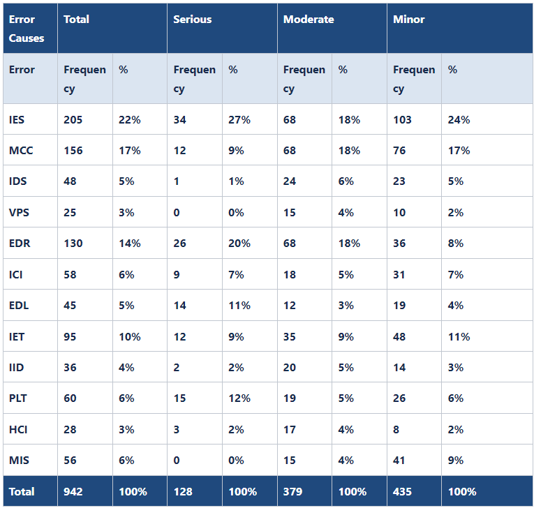
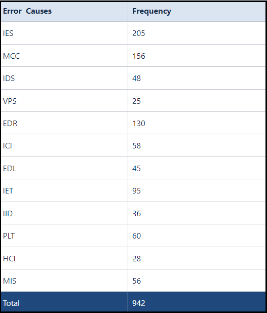
As a further explanation, the first two columns are used to develop a Histogram, as shown below:
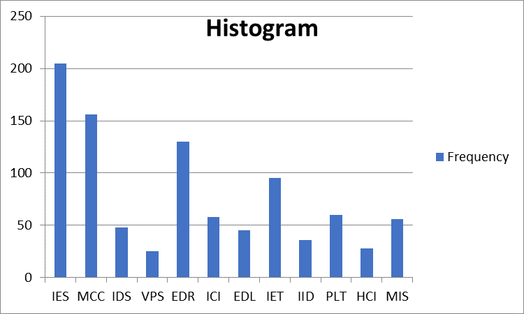
As mentioned below, using Excel, we can develop Histogram,
Usages of Histogram:
1. In Quality Planning: In this histogram, frequencies of issues in “IES”, “MCC”, and “EDR” are higher; you may choose to focus on enhancing the “Collecting Requirement” and “Defining Scope” processes as part of improvement efforts. The Histogram helps identify areas where improvements will have the most significant impact on quality. So, the histogram is a valuable tool for planning quality and taking preventive measures to improve processes.
2. In Quality Control: Histograms are a powerful tool in quality control as they help identify causes of poor performance and enable improvements in processes and work products. By analyzing the data represented in a histogram, corrective actions can be taken to address the identified issues and enhance overall quality.
3. In Agile Project Management: Histograms are also a valuable tool in Agile for visualizing data and facilitating data-driven decision-making. In an iteration retrospective, you can use a histogram to analyze the frequency of different types of defects, issues, or impediments encountered. For example, you can create a histogram showing the number of defects reported per iteration to identify recurring patterns and prioritize actions to improve quality. Similarly, during an iteration review, a histogram can be used to present data on completed user stories. For instance, the team can create a histogram to display the distribution of story points completed, helping stakeholders understand the progress in the iteration.
Difference between Pareto Chart and Histogram: The main difference between a Pareto chart and a histogram lies in the purpose they serve:
| Histogram | Pareto Chart |
| A histogram is a type of bar chart that shows the distribution of variables or causes of problems. It represents each cause as a column, and the height of the column represents the frequency of that cause. | A Pareto chart is a special kind of histogram that displays the causes of problems based on their overall influence. It helps prioritize corrective actions by showing the errors with the greatest impact in descending order of frequency. Additionally, it includes an arc that represents the cumulative percentage of cause frequencies. To explore more about Pareto charts, please refer – Pareto Chart – An Effective Graphical Tool to Resolve Problems |
A histogram is a bar chart commonly used in Total Quality Management (TQM). It shows the frequency of a cause of a problem occurring where the height of the bar is an indicator of the most affecting reason. For a visual presentation and further understanding of histograms, you can watch this video:
Answer: It is a tool to visually represent the causes of problems that are most affecting the given situation. It helps to understand the area which needs your focus to take corrective, preventive actions.
Answer: A histogram is a popular tool for analyzing large data. After analysis, it forms a bar chart to show influential factors that causes problems.
Answer: The histogram breaks up the range of possible values in groups measured in an interval scale. It shows data distribution in a convenient form to help discover appropriate corrective and preventive actions.
Answer: A histogram is a kind of bar chart where the bar’s height shows the event’s frequency. A Pareto chart is a special histogram where data are displayed using the 80/20 rule. Here most significant 20% of causes are visually presented in descending order of frequency.
I trust that this blog has effectively addressed all your inquiries regarding histograms and their significance in quality planning and control.
If you have aspirations to pursue the PMP certification, enroll with us for comprehensive support in your PMP certification journey. We offer expert guidance in exam preparation, assistance with the application process, and help in scheduling the exam. With our assistance, you can confidently navigate the certification process and increase your chances of success.
iZenBridge offers a wide range of comprehensive FREE resources to support you throughout your PMP certification journey. Explore our PMP Free Practice test, which provides a realistic simulation of the actual exam and helps you assess your preparedness with up-to-date questions. Our 50 Agile PMP Questions tutorial also delves deep into essential PMP Agile concepts, such as working with Requirements, value delivery, Agile Metrics, incremental delivery, and feedback. These tutorials provide detailed explanations and expose you to common Agile-related PMP exam questions. Whether you’re new to Agile or seeking to strengthen your understanding, our scenario-based PMP Agile questions are valuable tools for effective concept comprehension
As you prepare for the PMP Certification Exam, we’re thrilled to present our latest addition: a set of carefully curated practice questions. Designed to closely reflect the actual PMP exam’s complexity and style, these questions cover key domains including People, Process, and Business Environment, as outlined in the PMP Exam Content Outline (ECO). Each question is complemented by video explanations, offering deeper insights and enhancing your learning experience. Check Out PMP Questions
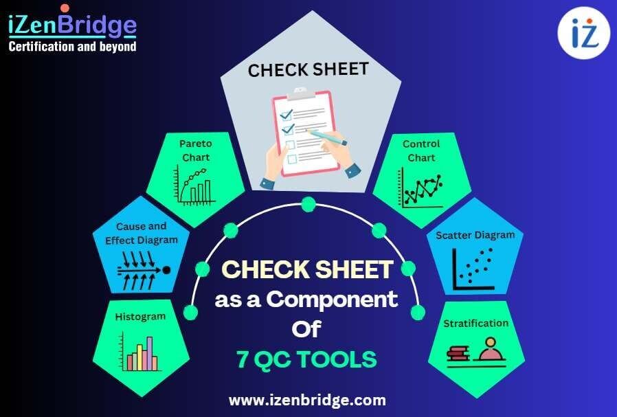
A Check Sheet is one of the 7 basic quality tools relevant to the Project ...
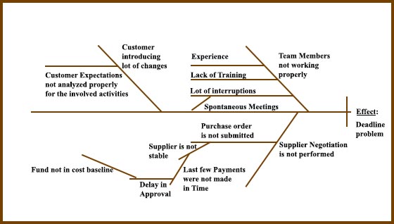
In the context of the PMP exam, a Cause-and-Effect Diagram, also known as an Ishikawa ...
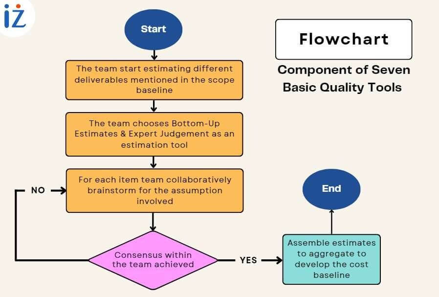
A flowchart, one of the seven basic quality tools, is defined as a graphical presentation ...
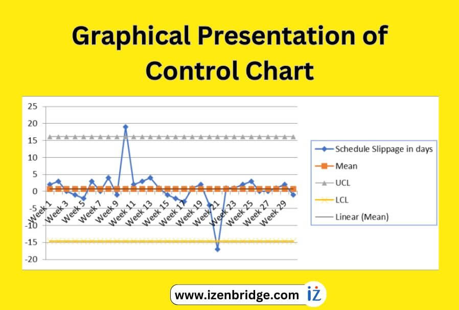
A control chart, a valuable quality tool in the PMP exam, helps us gain insights ...
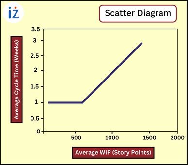
A scatter diagram in the PMP exam is a quality tool that aids project managers ...