The Pareto Chart is a valuable technique in the PMP exam for identifying the most critical areas of a problem and determining the appropriate focus for efforts. The success of a project, in terms of problem resolution, is not determined by the sheer number of successfully removed problems. Rather, it is judged by how effectively and successfully you identify and address recurring problems that significantly impact a product or service.
It is important to note that these recurring problems often contribute to the majority of the overall issues. If you invest efforts solely in resolving surface-level problems without addressing their root causes, these problems will inevitably resurface.
The main point I am emphasizing here is the importance of discovering the “Vital Few” problems that contribute to the majority of the issues. The Pareto Chart is a tool used to identify these “Vital Few” problems. It is based on the Pareto Principle, also known as the 80-20 rule, which states that roughly 80% of the effects or problems come from 20% of the causes or reasons.
Pareto Principle states that roughly 80% of the effects come from 20% of causes.
Visualizing and understanding 80% of the problems is relatively easy, and sometimes these problems appear significant and demanding of our attention. However, they can be distractions from the real issue that is impeding progress. If you fail to eliminate the source of the problems, they will resurface in the future.
Analyzing the Pareto Chart allows you to understand 20% of the “vital few” problems and provides guidance on where to focus our efforts effectively. After generating the Pareto diagram, you perform an analysis of the chart and engage in brainstorming to gain insights and recover from the vital few problems.
Roger S. Pressman in software engineering a practitioner’s Approach s in the Context of Pareto Principle
Give your time focusing on things that really matter, but first, be sure that you understand what really matters.
The Pareto Chart can be defined as related to the PMP exam::
It is a special form of vertical bar chart and is used to identify the vital few sources that are responsible for causing most of a problem’s effects.
Pareto Diagram Development Process:
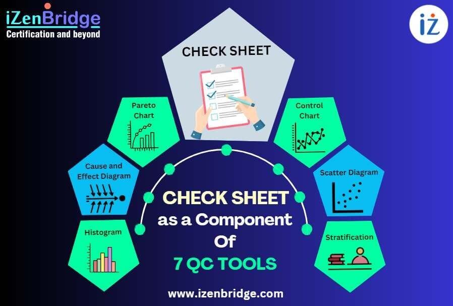
The development process of a Pareto Diagram involves utilizing a check sheet as the primary input. Please refer Check Sheet as a Component of Seven Basic Quality Tool for more details.
To illustrate this process, let’s revisit the example discussed in the Check Sheet Blog.
In this scenario, an IT test team member is evaluating work products to identify problems related to the agreed specifications. The team may decide to categorize the data regarding quality problems into the following categories:
Categories suggested by Roger S. Pressman:
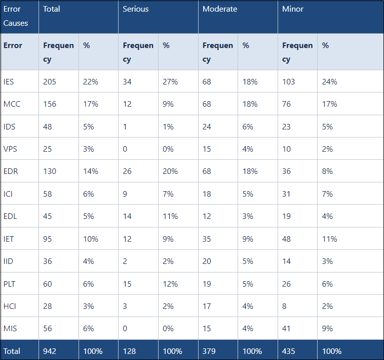
During the examination of work products, the test team member assesses the defects and records the frequencies associated with each respective category of causes in the following manner:
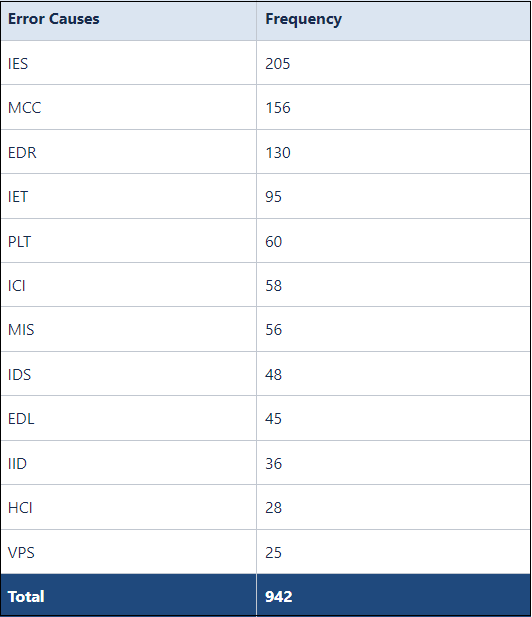
Check Sheet suggested by Roger S. Pressman in software engineering a practitioner’s Approach:
The first two columns of the above check sheet are used to develop the Pareto chart, as shown below:
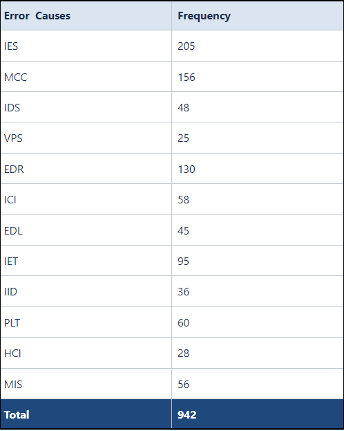
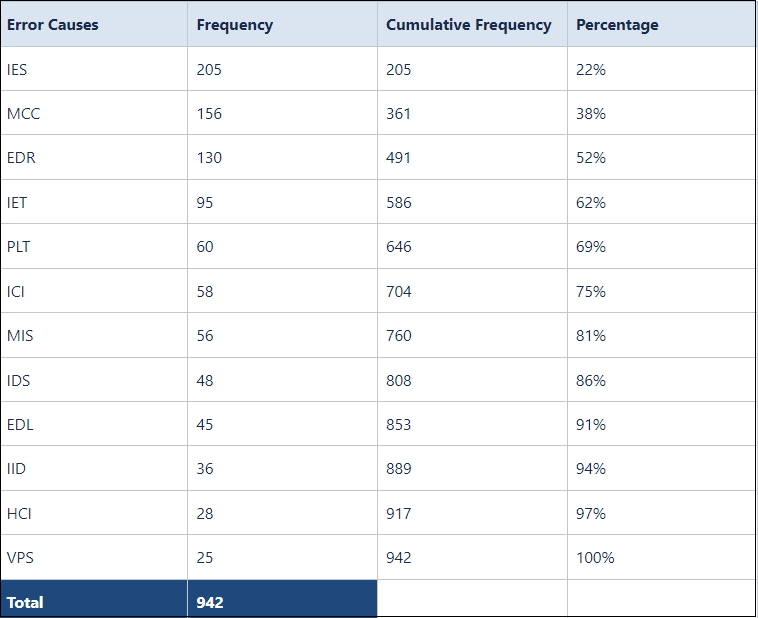
The table data is rearranged in descending order of frequency to develop cumulative frequency and relevant percentages, as demonstrated below:
The table above serves as an input for developing cumulative frequency and percentages in the following manner:
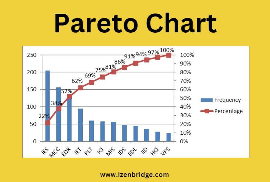
Now using Excel 2D Column Bar Chart, you develop Pareto Chart as Shown below-
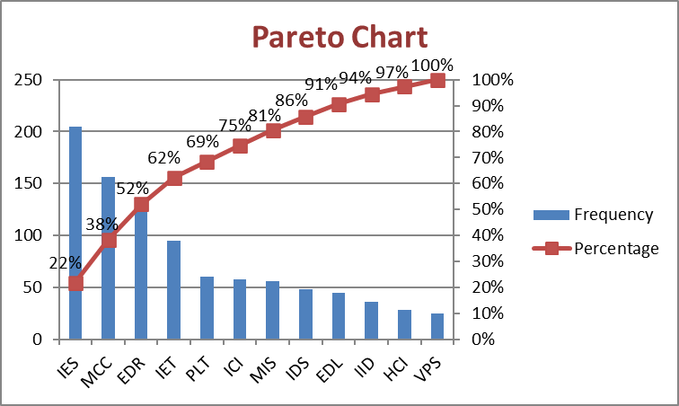
The close analysis shows that IES, MCC, and EDR account for 52% of all errors; these are:
Therefore, the three categories of causes mentioned above, “Incomplete or erroneous specification (IES),” “Misinterpretation of customer communication (MCC),” and “Error in data representations (EDR),” are identified as the Vital Few causes. Once these causes are corrected, the focus can shift to addressing the next items in the stack.
As an example, to address the Vital Few causes of “Incomplete or erroneous specification (IES),” “Misinterpretation of customer communication (MCC),” and “Error in data representations (EDR),” the team may decide to focus on the collecting requirements and Defining Scop processes of project management.
To enhance the quality of customer communication and specification for the identified causes, IES, and MCC, the team may opt to improve the effectiveness of the “Facilitated Work Shop” tool used in the requirement collection process. This tool helps engage stakeholders in a collaborative setting, facilitating effective communication and ensuring accurate and comprehensive requirement gathering. By enhancing the utilization of this tool, the team can improve the quality of customer communication and specifications, thereby addressing the root causes of IES and MCC.
Additionally, as part of the defining process, the team may choose to incorporate more rigorous data design reviews to address errors associated with EDR. By conducting thorough reviews of data representations and designs, the team can identify and rectify any potential errors, reducing the occurrence of EDR-related issues. This proactive approach ensures that data representations are accurate and align with the project’s requirements, thereby mitigating errors and enhancing the overall quality of the project.
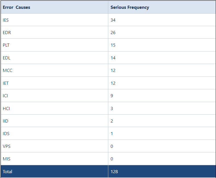
It is true that while focusing on the Vital Few causes based on cumulative frequency is important; there may be instances where additional factors need to be considered. For example, it might be necessary to select the Vital Few causes based on serious errors. In such cases, the following table can be used as an input to identify the Vital Few causes, sorted according to the “Serious Frequency” column:
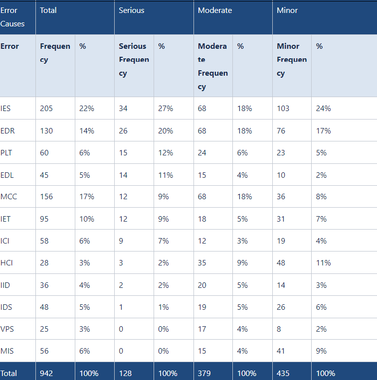
The above table shows that the most severe errors’ root causes are IES, EDR, PLT, and EDL. To visualize and prioritize these causes effectively, a Pareto chart will be developed using the following columns:
The steps explained earlier will be repeated to develop cumulative frequency, percentage, and, subsequently, the Pareto Chart.
Benefits of Pareto Chart Analysis: The analysis of a Pareto Chart offers several benefits across different project management contexts, including both traditional and Agile approaches.
In conclusion, The Pareto Chart is a powerful project management tool applicable to both traditional and Agile approaches. It utilizes quantitative data generated by check sheets to support Pareto analysis. By identifying the vital few causes that contribute to the majority of problem effects, the Pareto Chart enables teams to prioritize efforts effectively. During project execution, it aids in taking corrective action by pinpointing areas for enhancement. It guides improvement strategies by analyzing past project records and supports data-driven decision-making. In Agile projects, the Pareto Chart facilitates continuous improvement and project success by focusing on critical issues with the greatest impact on quality. It drives change, improves processes, and delivers superior results in both traditional and Agile project environments.
I trust that this blog has effectively addressed all your inquiries regarding the Pareto Chart and its significance in quality planning and control.
If you have aspirations to pursue the PMP certification, enroll with us for comprehensive support in your PMP certification journey. We offer expert guidance in exam preparation, assistance with the application process, and help in scheduling the exam. With our assistance, you can confidently navigate the certification process and increase your chances of success.
iZenBridge offers a wide range of comprehensive FREE resources to support you throughout your PMP certification journey. Explore our PMP Free Practice test, which provides a realistic simulation of the actual exam and helps you assess your preparedness with up-to-date questions. Our 50 Agile PMP Questions tutorial also delves deep into essential PMP Agile concepts, such as working with Requirements, value delivery, Agile Metrics, incremental delivery, and feedback. These tutorials provide detailed explanations and expose you to common Agile-related PMP exam questions. Whether you’re new to Agile or seeking to strengthen your understanding, our scenario-based PMP Agile questions are valuable tools for effective concept comprehension.
No Trainings found

Histogram As A Component Of Seven Basic Quality Tools In the Project Management Professional (PMP) ...
A Check Sheet is one of the 7 basic quality tools relevant to the Project ...
In the context of the PMP exam, a Cause-and-Effect Diagram, also known as an Ishikawa ...
A flowchart, one of the seven basic quality tools, is defined as a graphical presentation ...
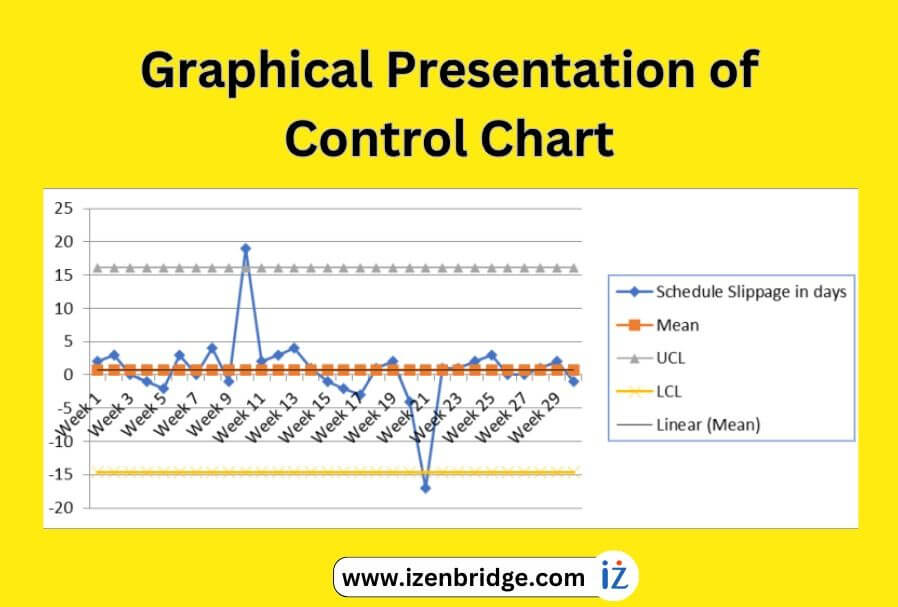
A control chart, a valuable quality tool in the PMP exam, helps us gain insights ...
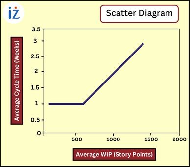
A scatter diagram in the PMP exam is a quality tool that aids project managers ...