A control chart, a valuable quality tool in the PMP exam, helps us gain insights into the behaviour, predictability, and stability of a process over time. While every process exhibits some inherent variability, it is crucial to identify when this variability exceeds acceptable limits, and the process goes “out of control.”
So, in the context of the Project Management Professional (PMP) exam, a Control Chart can be defined as –
A visual display of data over time against established control limits. In addition to the control limits, the control chart incorporates a central line (depiction of the mean value) to facilitate the identification of trends. Chart shows how the plotted data spreads across the centerline and if these data approaches the control limits. When data points fall outside the control limits or show a lack of random output in a repetitive process, it reflects a deviation that needs corrective action.
Control charts allow project managers to detect and address any unexpected deviations or changes, enabling timely intervention to maintain quality and stability. These are primarily used to monitor the output variable of repetitive activities, but they can also track cost and schedule variances, among other factors.
In addition to control charts, there are several other essential quality tools that project managers can explore. For further information and insights on these tools, you can refer to the following series of blog posts:
These resources will provide detailed insights into each tool, its purpose, and how they can be effectively utilized in project management.
In control charts, a process continuous variable X measures if the process is out of control. Now, let’s see what could be the examples of continuous variables (X) related to the control chart:
Using control charts for these variables visually represents the process behaviour. It helps detect when the process variability exceeds acceptable limits, indicating the need for corrective actions or adjustments.
Control charts are typically developed for processes that meet the following criteria:
A control chart consists of the following components:
Graphical representation of Control Chart Components:
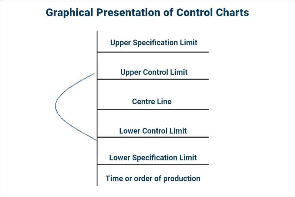
For repetitive processes, the control limits on a control chart are typically set at ±3 sigma around the process mean, also known as the Centre Line. The upper control limit is drawn at 3 standard deviations above the process mean, while the lower control limit is set at 3 standard deviations below the process mean.
We establish these limits to predict if the process needs corrective action to improve performance in line with the required stability and capability. Analysis of data points with the center line and control limits helps us to prevent unnatural process performance with time. Control limits are more stringent than Specification Limits. So that we can take corrective actions before data points start reaching the specification limit.
How to determine process is “In Control” or “Out of control”:
Data points that fall within ±3 sigma (standard deviations) of the centre line are considered “In Control.” This means the data points are within acceptable limits and do not exceed the control limits. However, we exclude the rule of seven for this determination.
The Rule of Seven – If seven consecutive data points appear on either side of the mean (centre line), we consider the process “Out of Control” based on the heuristic of the Rule of Seven. This indicates that even though the data points may not cross the control limits, the lack of random output in a repetitive process suggests a potential problem.
An “Out of Control” process has either data points outside the acceptable limits of ±3 sigma or seven consecutive data points appearing on either side of the mean (centre line). This situation shows special cause variances.
In Summary, Special Cause Variances can be seen when a data point falls outside the control limits on a control chart or when there is a pattern or trend in the data, such as seven consecutive data points falling on either side of the mean (Rule of Seven).
3. Investigating Process Problems (Special Cause Varainces): When special cause variance is present in a process, further investigation is required to identify and address the underlying root causes of the variation to bring the process back into control.
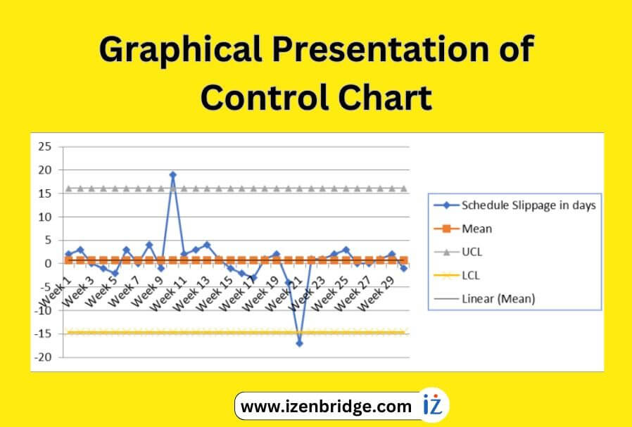
Let’s consider an example of a process that involves testing repetitive weekly builds:
The target is to complete the weekly build by the end of the day on Friday. However, observations show that sometimes the build gets delayed by 1 or 2 days, while on other occasions, it finishes a day early. To determine the acceptable range of variation mathematically, we can use a control chart. The control chart helps us establish control limits that define the acceptable range of variation. In this case, the process owner may accept a variation of up to one day early or one day late. By analyzing the data collected over 30 weeks on the control chart, we can assess whether the process output falls within the established acceptable limits. If any of the weekly builds deviate beyond the control limits, it indicates a need for corrective action to address the underlying issues in the process.
| Week | Build Slippage in days |
| Week 1 | 2 |
| Week 2 | 3 |
| Week 3 | 0 |
| Week 4 | -1 |
| Week 5 | -2 |
| Week 6 | 3 |
| Week 7 | 0 |
| Week 8 | 4 |
| Week 9 | -1 |
| Week 10 | 19 |
| Week 11 | 2 |
| Week 12 | 3 |
| Week 13 | 4 |
| Week 14 | 1 |
| Week 15 | -1 |
| Week 16 | -2 |
| Week 17 | -3 |
| Week 18 | 1 |
| Week 19 | 2 |
| Week 20 | -4 |
| Week 21 | -17 |
| Week 22 | 1 |
| Week 23 | 1 |
| Week 24 | 2 |
| Week 25 | 3 |
| Week 26 | 0 |
| Week 27 | 0 |
| Week 28 | 1 |
| Week 29 | 2 |
| Week 30 | -1 |
Now we need to calculate the average of slippage in build for 30 weeks: Average of slippage of data points in days, i.e., 0.73 days.
Now Standard deviation is calculated. Standard deviation means how much variation from the average:
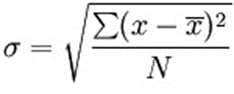
σ = the standard deviation
x = each value in the population
x̄ = the mean of the values
N = the number of values
To summarize the calculation of control limits for the given example:
Following is summary information for calculations for the given an example:
These values help establish the control limits for the process and provide a reference range for determining if the slippage in build time is within acceptable limits.
Now finally control chart can be developed using a 2D line graph plot:
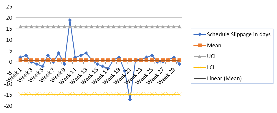
Control chart (x) using mean + 3 sigma and mean – 3 sigma control limits
In this chart, there are two data points (two weeks) that are beyond the control limits, and we need to do further investigation. As mentioned earlier, the control limit helps us determine whether corrective action is required. When data points are beyond the control limit, it shows that variability is not natural.
Analysis of standard deviation and control chart –
To aid in this investigation, additional tools such as the Cause and Effect diagram and Pareto Analysis can be utilized. A brainstorming tool can also be employed in conjunction with these tools. After conducting a thorough root cause analysis and implementing corrective actions, it is essential to redraw the control chart. This allows us to track the progress and assess whether the variation is decreasing over time.
A crucial aspect to address is the presence of the special cause, here in the above example represented by the two weeks with data points exceeding the control limits. The collaborative approach helps identify and gain insight into the specific events or circumstances that occurred during those two weeks, ultimately leading to the identification of the root causes behind the observed variation.
Analyzing Process Performance and Variability: The Use of Control Charts in the PMP Context
To obtain further information about the control chart, please check out the video provided below:
To summarize, control charts are essential quality tools used for both quality planning and control. They provide a visual representation of data over time and help determine if a process is stable, generating results within acceptable limits and exhibiting random variation. By identifying special cause variations, control charts facilitate the implementation of corrective actions. I hope this blog has provided you with the information you were seeking regarding the usage and significance of control charts. If you have any further questions, feel free to ask in the comments below.
If you have aspirations to pursue the PMP certification, enroll with us for comprehensive support in your PMP certification journey. We offer expert guidance in exam preparation, assistance with the application process, and help in scheduling the exam. With our assistance, you can confidently navigate the certification process and increase your chances of success.
iZenBridge offers a wide range of comprehensive FREE resources to support you throughout your PMP certification journey. Explore our PMP Free Practice test, which provides a realistic simulation of the actual exam and helps you assess your preparedness with up-to-date questions. Our 50 Agile PMP Questions tutorial also delves deep into essential PMP Agile concepts, such as working with Requirements, value delivery, Agile Metrics, incremental delivery, and feedback. These tutorials provide detailed explanations and expose you to common Agile-related PMP exam questions. Whether you’re new to Agile or seeking to strengthen your understanding, our scenario-based PMP Agile questions are valuable tools for effective concept comprehension.

Histogram As A Component Of Seven Basic Quality Tools In the Project Management Professional (PMP) ...

A Check Sheet is one of the 7 basic quality tools relevant to the Project ...
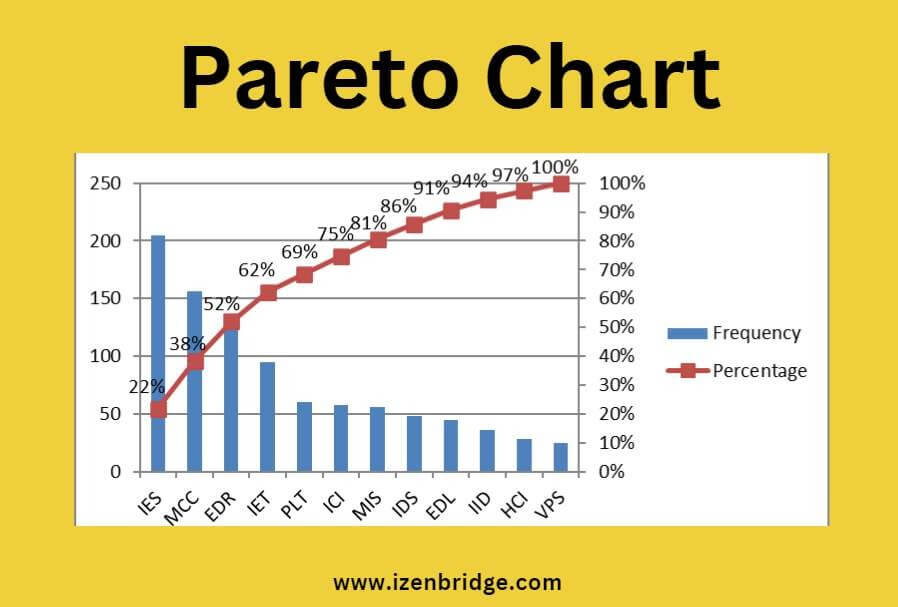
The Pareto Chart is a valuable technique in the PMP exam for identifying the most ...
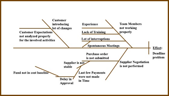
In the context of the PMP exam, a Cause-and-Effect Diagram, also known as an Ishikawa ...
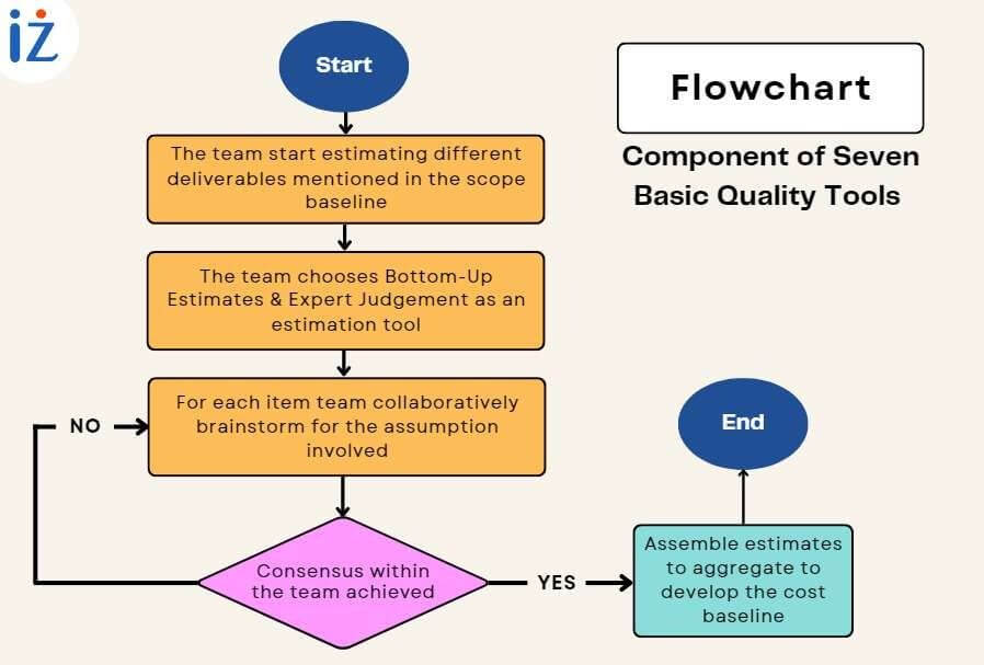
A flowchart, one of the seven basic quality tools, is defined as a graphical presentation ...
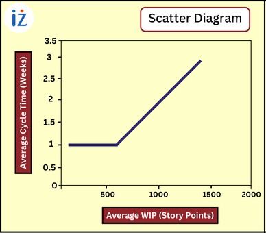
A scatter diagram in the PMP exam is a quality tool that aids project managers ...