A scatter diagram in the PMP exam is a quality tool that aids project managers in analyzing and comprehending the relationship between two variables. It displays the changes in a dependent variable alongside changes in the independent variable. By observing the correlations between these variables, project managers can identify influential factors that require control for quality improvement.
In the context of the Project Management Professional (PMP) exam, a Scatter Diagram can be defined as –
A correlation graph chart uses a regression line to explain or to predict how the change in an independent variable will change a dependent variable.
Correlation, which is represented by a regression line, can be positive or negative. This tool is typically utilized when Quality Control identifies a variable that is not in control but systematically changing alongside another variable. The variable influencing the other variable is referred to as an independent or control parameter.
In a Scatter Diagram, the independent variable is plotted on the horizontal axis, while the dependent variable is plotted on the vertical axis. It can be created using two variables even if there is no control parameter. In such cases, either type of parameter can be plotted on either axis. The main objective in this scenario is to demonstrate any degree of correlation between the two variables.
Apart from Scatter Diagrams, there are other quality tools available for project managers to explore. To gain more information and insights about these tools, you can refer to a series of informative blog posts.
These resources offer in-depth insights into each tool, its purpose, and effective utilization in project management.
There are three types of correlation in a Scatter Diagram:
The positive and negative correlation can be further categorized like:
Correlation can be identified when there is a cause-and-effect relationship between two parameters. In the case of a strong correlation, efforts can be made to either strengthen or weaken the independent parameter based on whether the correlation is positive or negative. This can help in achieving the desired values of the dependent variable.
Development of Scatter Diagram:
To explain the development of the scatter plot, I am taking the example of WIP (Work in Process) limit, throughput, velocity, and Cycle time; it seems that the WIP limit highly influences the cycle time of products.
Cycle time is the elapsed time that begins when a team commits to working on an item and ends when the team completes the item. It measures the time taken by the team to finish the item, encompassing all the activities and processes involved in its completion.
Before diving into development, it is crucial first to understand the cause-and-effect relationship between Work in Progress (WIP) and Cycle time. In this context, the Scatter plot is typically utilized when there is a mathematical relationship between these two variables. By analyzing the Scatter plot, you gain insights into how changes in the WIP impact the Cycle time, enabling you to make informed decisions and optimize development processes accordingly.
When many items are introduced into the process flow, it necessitates significant effort in planning, executing, monitoring, controlling, and closing all the involved items. Consequently, this influx of work in progress (WIP) impacts the cycle time of products. Managing the WIP is a management decision based on workflow analysis, highlighting the importance of comprehending the flow of work within the system. Understanding the dynamics of WIP and its relationship to cycle time enables effective management and optimization of the overall process. With constant throughput (the number of work the team completes in a given time or iteration), and velocity (story points completed per iteration), WIP and cycle time are proportional. Therefore, if throughput and velocity are held constant, reducing the average cycle time is possible by reducing the average WIP limit. Here throughput and velocity are related to the production speed and are well-defined for the team; hence these are constant.
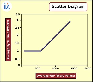
For the Scatter Diagram, it is essential to understand which is dependent and which is independent. Here WIP is the independent variable, and cycle time is a dependent variable.
Assume a project with a capacity of 500 user story points per week; under this assumption, if you start 500 story points or less each week, the cycle time for each will be one week (because you have enough capacity to process them all during the week). Suppose you begin with a backlog of 500 story points, and each week you add 500 more, resulting in a total Work in Progress (WIP) of 1000 story points. However, you can only process 500 story points in a given week. As a result, on average, each story point will spend two weeks in the process flow: one week waiting in the backlog and the following week being actively worked on. This pattern continues, where an increase in the WIP leads to a proportional increase in the average cycle time. For instance, the average cycle time will be three weeks if you have 1500 story points in the process. This relationship is demonstrated in the scatter graph below, illustrating the correlation between WIP and cycle time.
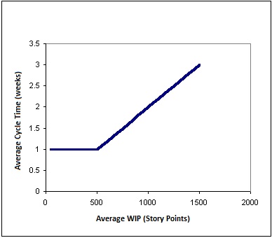
This is an example of a strong positive relationship between two variables, i.e., WIP and Cycle time, meaning that higher levels of WIP lead to longer cycle times.
The graph below illustrates the relationship between average velocity and average Work in Progress (WIP). In a process with a fixed capacity, the velocity is limited to the amount that is started per week. As the WIP in the process approaches the capacity of 500 story points per week, the velocity reaches its maximum level. Regardless of the amount of WIP added to the process, the velocity will never exceed 500 story points per week unless the process capacity is increased.
As depicted in the first chart, increasing the WIP leads to longer average cycle times. This demonstrates that higher levels of WIP result in slower overall progress and increased cycle times. Therefore, managing WIP levels is essential to maintain a balanced workflow and optimize velocity, throughput, and cycle time.
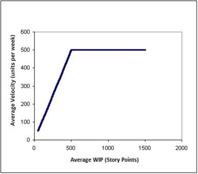
So, we can conclude: Start exactly 500 story points each week. This will maximize velocity while cycle time remains at a minimum of one week.
The Scatter Diagram is utilized for various purposes in project management:
I hope this blog has addressed all your questions and provided comprehensive information about the Scatter Diagram. You can watch the following video to get more insight:
In summary, the Scatter Diagram is a valuable tool for understanding the influence of the independent variable on the dependent variable in project management. It facilitates both preventive and corrective actions to achieve desired outcomes.
Feel free to write any further questions or comments in the comment box below. I am here to assist you and provide any additional information you may need.
If you have aspirations to pursue the PMP certification, enroll with us for comprehensive support in your PMP certification journey. We offer expert guidance in exam preparation, assistance with the application process, and help in scheduling the exam. With our assistance, you can confidently navigate the certification process and increase your chances of success.
iZenBridge offers a wide range of comprehensive FREE resources to support you throughout your PMP certification journey. Explore our PMP Free Practice test, which provides a realistic simulation of the actual exam and helps you assess your preparedness with up-to-date questions. Our 50 Agile PMP Questions tutorial also delves deep into essential PMP Agile concepts, such as working with Requirements, value delivery, Agile Metrics, incremental delivery, and feedback. These tutorials provide detailed explanations and expose you to common Agile-related PMP exam questions. Whether you’re new to Agile or seeking to strengthen your understanding, our scenario-based PMP Agile questions are valuable tools for effective concept comprehension.
| Name | Date | Place | – |
| PMP Certification and Training | 15 – 30 November 2025 | Bangalore | More Details |
| PMP Certification and Training | 9 Dec’25 – 7 Jan’26 | Chennai | More Details |

Histogram As A Component Of Seven Basic Quality Tools In the Project Management Professional (PMP) ...
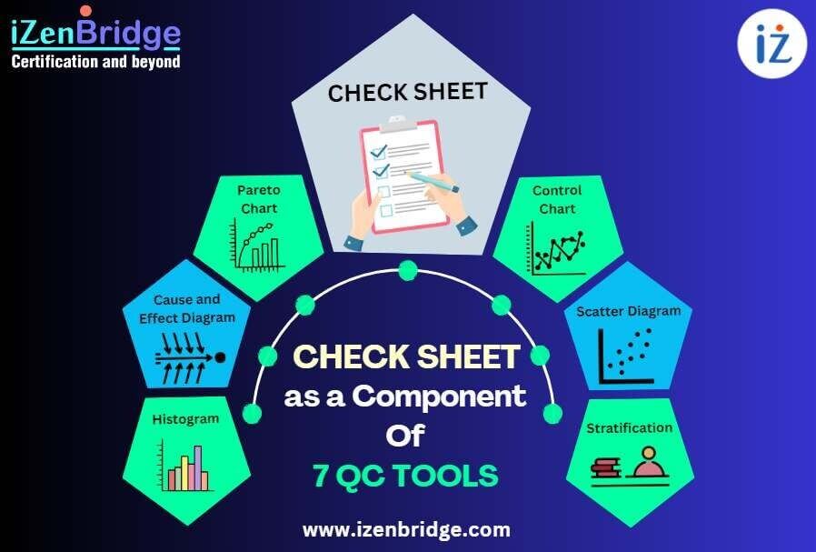
A Check Sheet is one of the 7 basic quality tools relevant to the Project ...
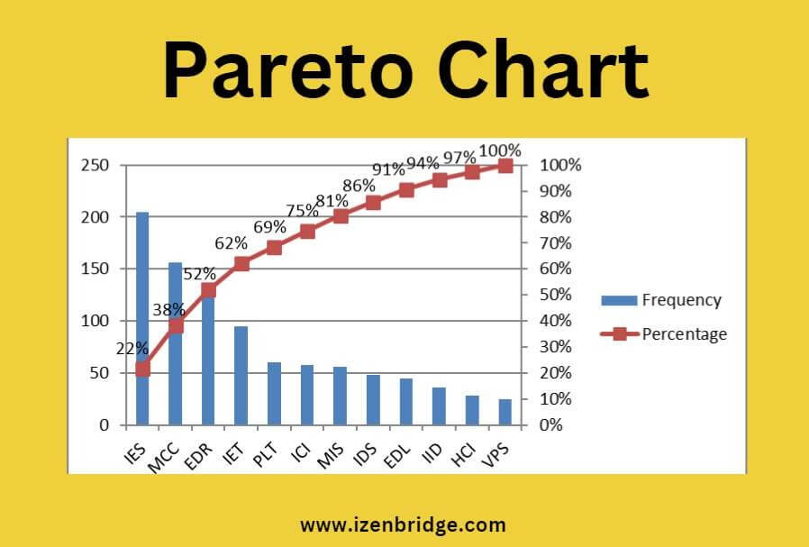
The Pareto Chart is a valuable technique in the PMP exam for identifying the most ...
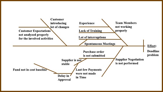
In the context of the PMP exam, a Cause-and-Effect Diagram, also known as an Ishikawa ...
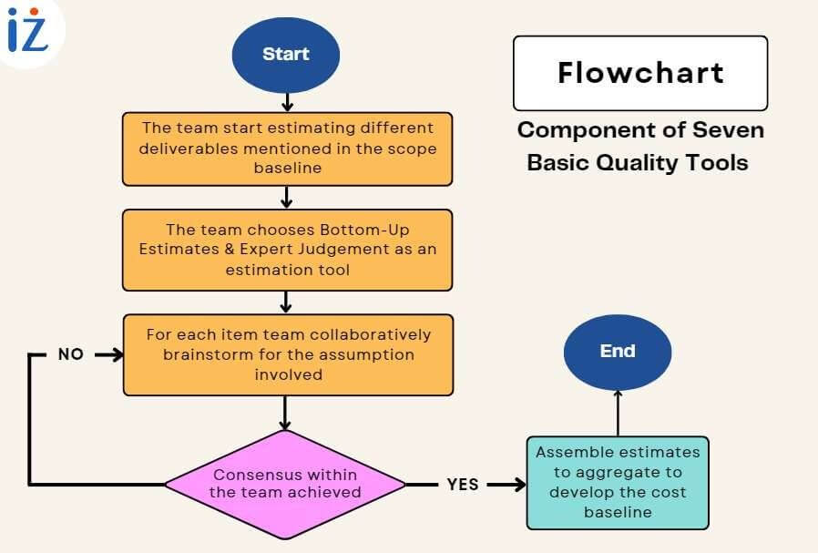
A flowchart, one of the seven basic quality tools, is defined as a graphical presentation ...
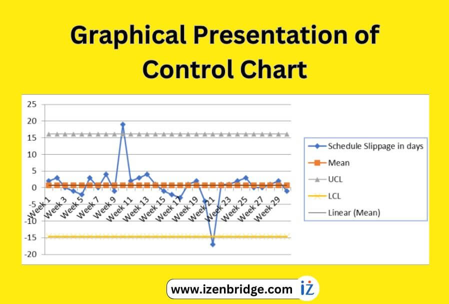
A control chart, a valuable quality tool in the PMP exam, helps us gain insights ...