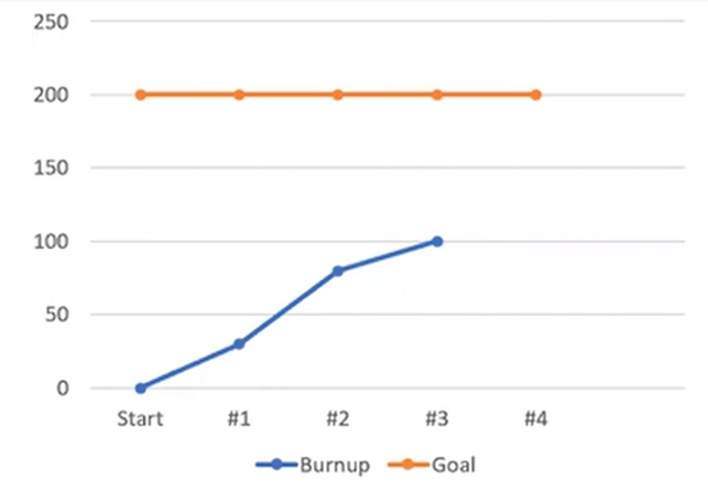
PMP Q #35- Burnup Chart

Q35. The release was planned in four iterations. What can be inferred from the burnup chart below after the third iteration? (select Three).
A. The release is behind schedule.
B. 100 story points of work is done.
C. The team size is reduced in the third iteration.
D. The velocity of the second iteration was more than the. First
You need to find one statement you cannot infer from this chart. So there are three true statements and one false statement.
Let’s go to a diagnosis of this particular chart. So what are these X-axis Y axis, and two graph lines? A burnup chart is a graph that shows project progress or the amount of work done over time. Two main lines, one (here orange line) for the anticipated total work and the other showing actual work completed (blue line). So, the blue line shows actual progress, whereas the orange line, in this particular case, shows you the target or goal. Here, the graph shows actual work burned and target work in Story Points.
Now. Now let’s see what we have in the options –
Option A – “The release is behind schedule” – The release is behind schedule – You need to calculate the remaining work by the difference between these two lines. At the end of 3rd iteration, the remaining work is 100, whereas it should be around 50. You have more work left than anticipated because you can complete 50 story point work per iteration. This information is not reflected in the graph, but you can fairly say. There is no clear statement, but an obvious indicator is coming.
Option B- “100 story points of work is done” – You are at the end of iteration 3. The graph shows 100 story points work is done.
Option C – “The team size is reduced in the third iteration” – There is a decline in the velocity in the 3rd iteration; there could be some challenges. There could be some poor technical results or something else. It’s tough to say that team size is reduced in the 3rd iteration. So this is the correct option.
But still, let’s look at option D -“The velocity of the second iteration was more than the first iteration” – This is coming from the clear slope of the line. The slope shows more burnt points in the second iteration. During the first iteration, the team burnt around 30 or 40 story points, but in the second, they burnt around 50 or 60 story points.
Without much of an assumption, you can interpret –
– that team is behind because 50% of the work remains; they are left with 25% of the time.
– In contrast, the information about team size (Option C) is not a clear indicator from this particular graph.
So if you have to choose the answer, you should go with A, B & D, which means option C cannot be inferred from this particular burnup chart.
